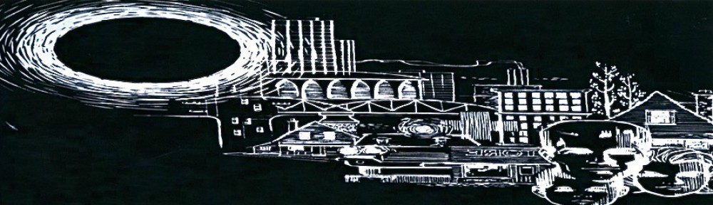
Consider the font for the city of Edmonton:
![]() The curved “E,” the bulky, serifed font: like an old Barbara Streisand or Neil Diamond LP from a garage sale, something about it smells musty, but not quite retro. When the font was develop in the early 1970s by Herb Lubalin and Antonio DiSpigna it probably seemed ultra modern and cool. The font is called ITC Serif Gothic, and it was used on many products during the 1970s. Now, however, it seems to call attention to Edmonton’s many failed attempts to catapult the city to the newest and most modern developments in design: mega malls, urban freeways.
The curved “E,” the bulky, serifed font: like an old Barbara Streisand or Neil Diamond LP from a garage sale, something about it smells musty, but not quite retro. When the font was develop in the early 1970s by Herb Lubalin and Antonio DiSpigna it probably seemed ultra modern and cool. The font is called ITC Serif Gothic, and it was used on many products during the 1970s. Now, however, it seems to call attention to Edmonton’s many failed attempts to catapult the city to the newest and most modern developments in design: mega malls, urban freeways.